Nothing stands still, particularly in online and accordingly, it is important for anyone involved in digital communications to be looking at best practice in trends, technologies with a view to taking learning and delivering great experiences for users.
I will update (as much as possible!) on what I see are nice sites; just organisations, businesses building beautiful touchpoints for their users.
This month we travel figuratively (unfortunately) to London and New York.
London
The Windmill Taverns Group run four successful pub/restaurants across South London and house each individual site under one group umbrella.
The main central site houses salient information on the Group; its history and its people as well as acting as a central repository for events.
 The site oozes character and delivers effective overview of four distinct pubs under one umbrella company.
Each tavern is represented distinctly, but consistently identifiable as a Windmill Taverns Group premise. Look and feel remains consistent throughout although sites are under their own urls, using different font-families etc.
Other great features of the sites include:
- clever use of svgs to implement subtle animation in footer etc.
- use of great photography bursting with spark, character across the taverns giving clear sense of place
- content is always fresh; ensuring food, event information is always timely and current Rugby World Cup promotions exemplify this.
Together with the effective use of social media channels the Group ensure that a sense of sprightliness and energy is maintained throughout their online assets – invitation is warm, and character firmly conveyed.
New York
The New Yorker delivers an uncluttered, consistent user experience in the delivery of some weighty content.
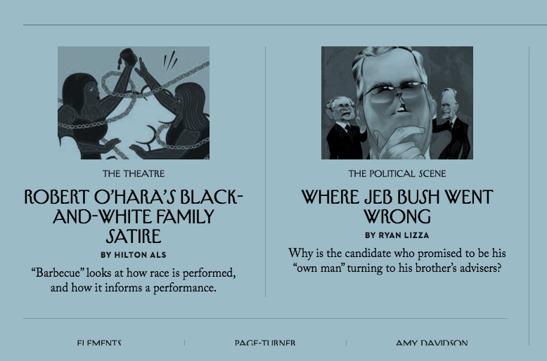
Branding is clear, professional, while unusually and distinctly for an online magazine, the use of photography is minimal throughout; the site instead opting for quality illustrations to draw the eye to key content pieces.
 The New Yorker presents fonts professionally and in a distinctively creative manner.
The sticky header on desktop scroll etc. means primary navigation remains in focus for the user without getting in the way of content at-hand.
The site scales brilliantly across devices, making the most of space available. Colour is soft and sparse, and used effectively to highlight key areas for calls to action / promotion.
The design shows how grid-driven design needn’t be boring in that it appreciates and implements negative space effectively, and this along with great vertical rhythm in margin and padding gives content room to breathe.
Finally, fonts are vividly pronounced and render crisply, and swiftly across devices.